
Core Math Worksheets
Fraction Worksheets
Algebra
Other Worksheets
Place Value
Percentages
Rounding Numbers
Ordering Numbers
Standard, Expanded, Word Form
Mean Median Mode Range
Ratio Worksheets
Probability Worksheets
Roman Numerals
Factorization, GCD, LCM
Prime and Composite Numbers
Pre-Algebra
Geometry Worksheets
Blank Clocks
Telling Analog Time
Analog Elapsed Time
Greater Than and Less Than
Money
Arithmetic Sequences
Geometric Sequences
Venn Diagram
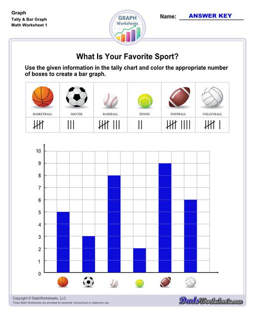
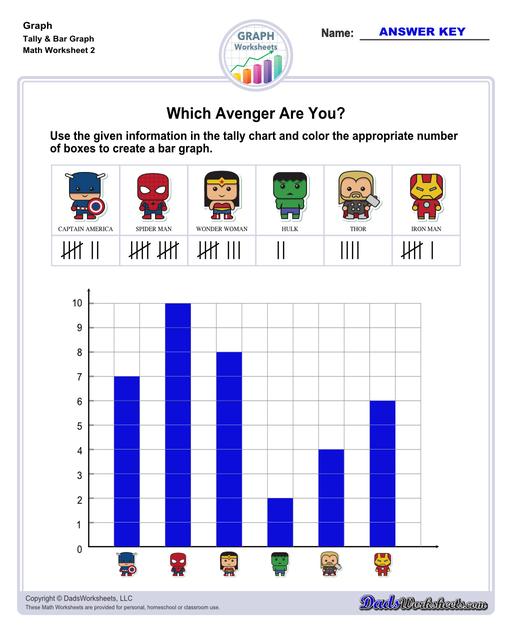
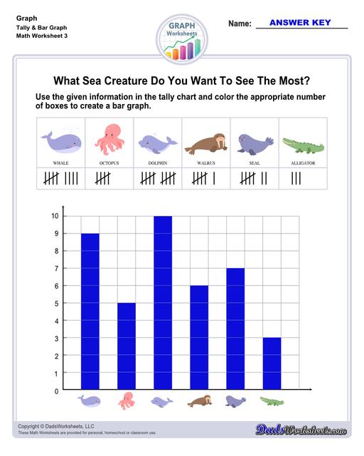
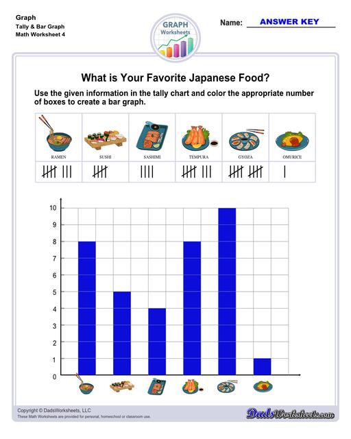
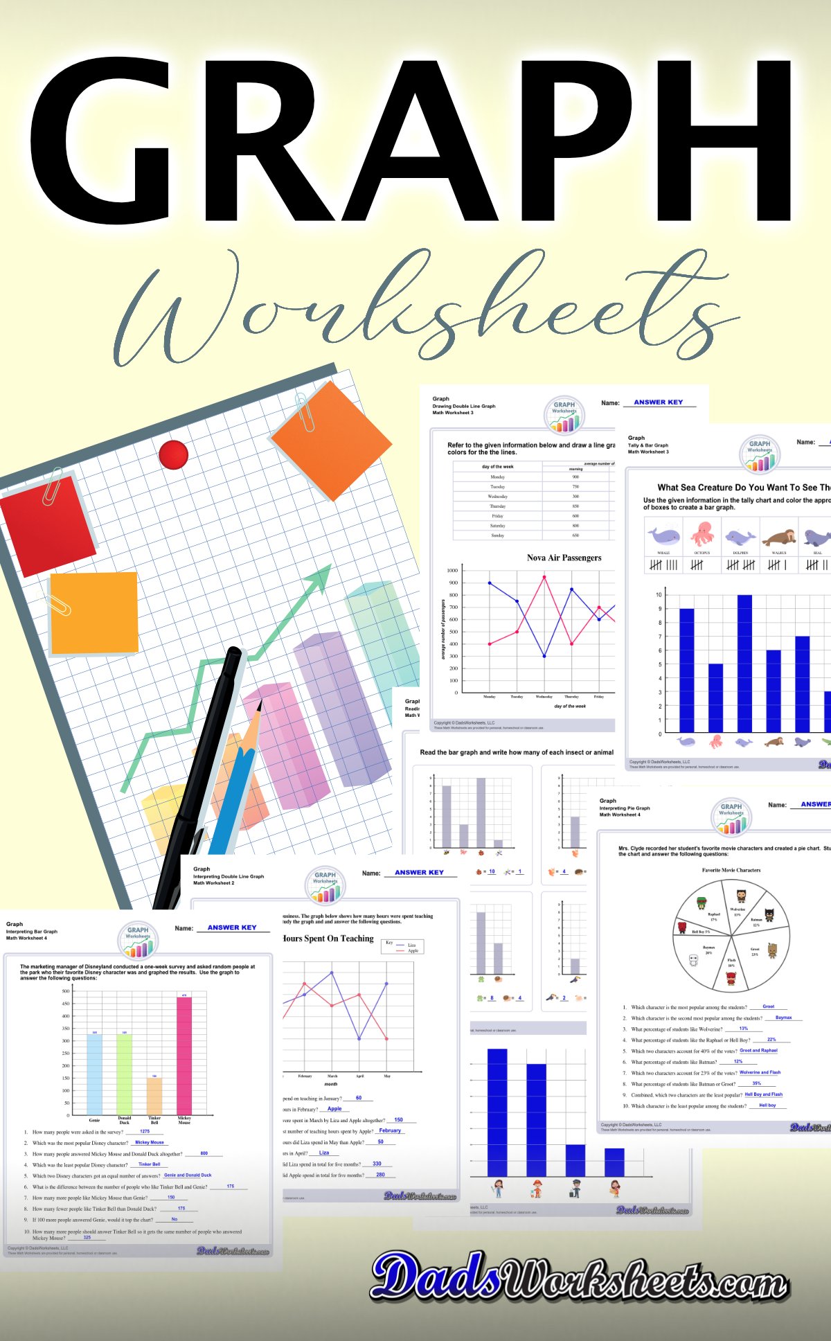
Graph Worksheets
Measurement & Conversions
Patterns and Puzzles
Color by Number
Holiday & Seasonal
Early Learning
Printables
Calculators
Math Worksheets by Grade
Worksheet News
Graph Worksheets
Graph worksheets for practice visually representing data and understanding relationships between variables. These worksheets include reading graphs, creating graphs, and interpreting different types of graphs.
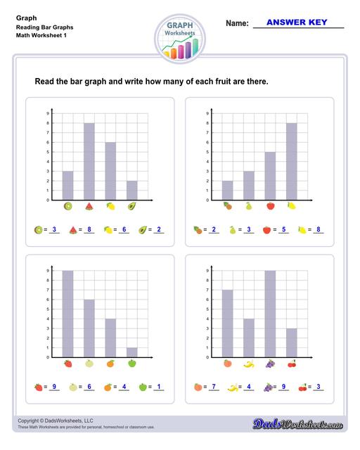
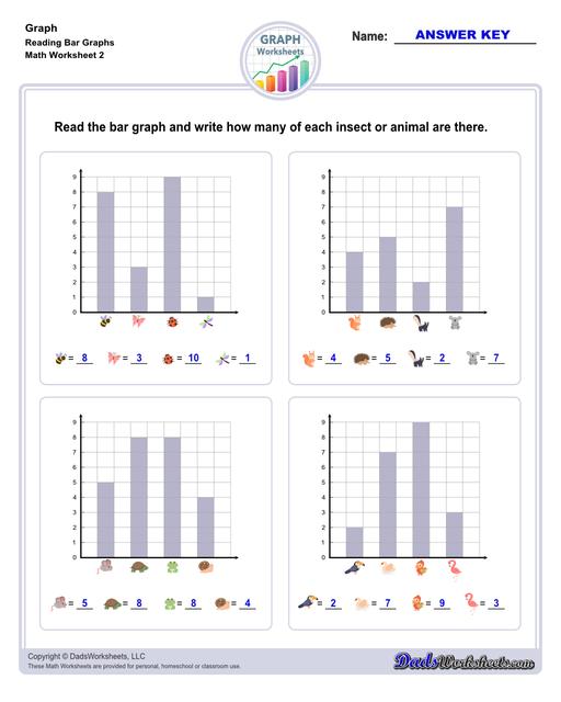
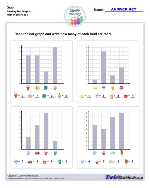
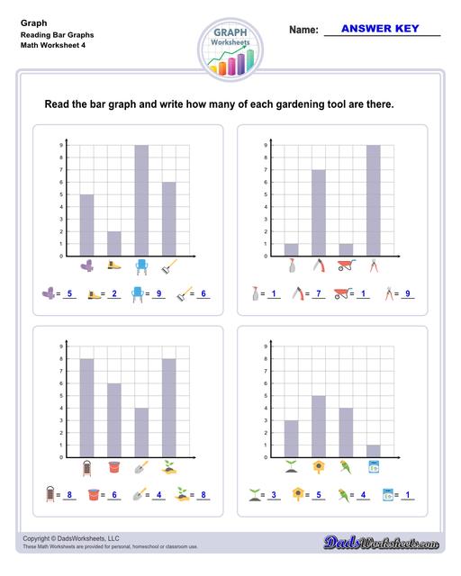
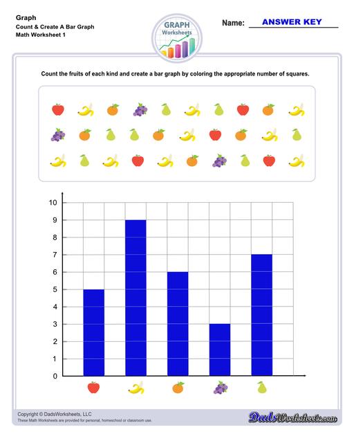
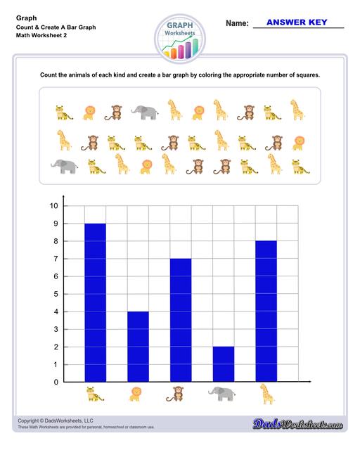
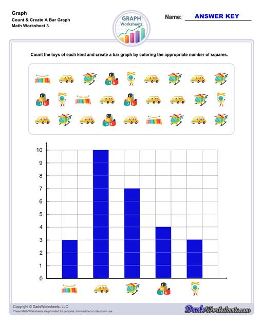
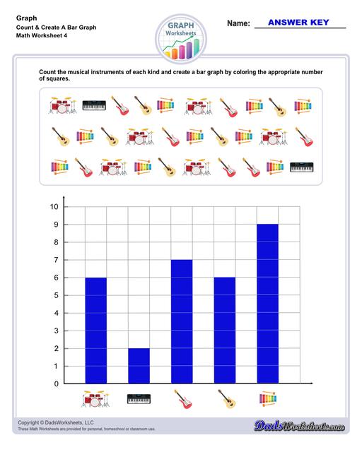
Bar Graph Worksheets
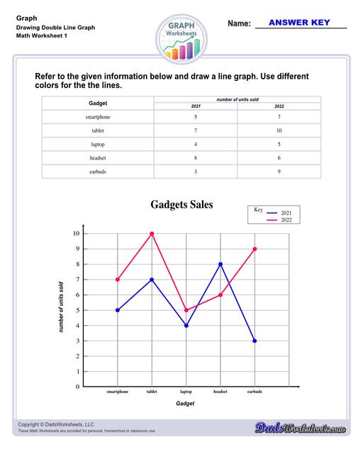
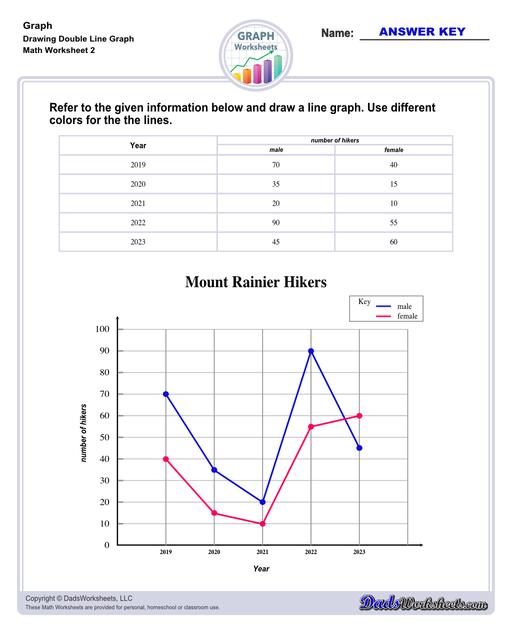
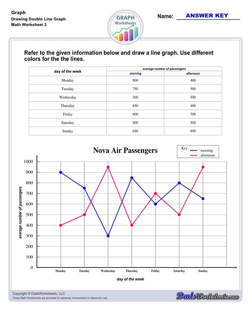
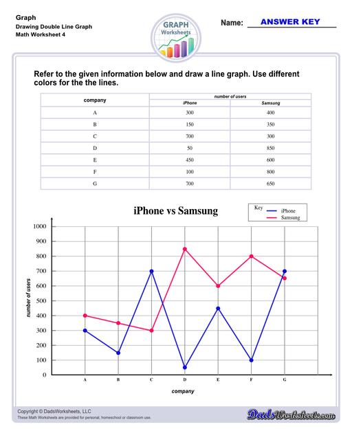
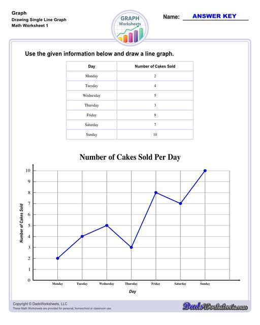
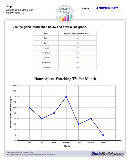
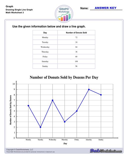
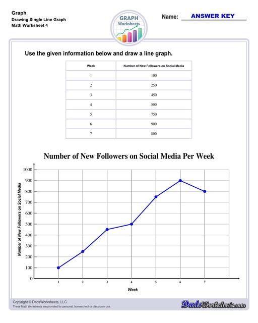
Line Graph Worksheets
Pie Graph Worksheets
Parts of a Bar Graph
Graphing, also known as data visualization or plotting, represents data and numerical information in graphical form. Furthermore, a bar graph is a way of representing data graphically in the form of bars. The height of the bars corresponds to the data they represent. Like all graphs, bar graphs are also presented on a coordinate plane having an x-axis and a y-axis. Refer to the image below to see the different parts of a bar graph.

Let me explain a bit further about the parts…
Reading Graphs
Learning to read graphs properly is a matter of interpreting which pieces of information go together. Graphing involves using visual elements like points, lines, bars, and other symbols to illustrate the relationships, patterns, and trends present within the data. Graphs provide a more accessible and intuitive way to understand complex information, making it easier to identify insights and draw conclusions.
So how do we read and interpret graphs? Let’s use the same example above and go through the steps together:
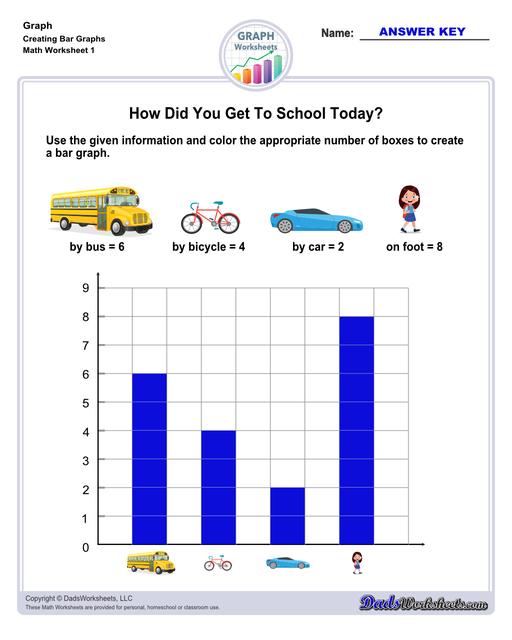
Step 1: Read the title of the graph. As mentioned earlier, the title tells us what the graph is all about. The title of our example ‘How Did You Get To School Today’ gives us an idea that we are reading a collection of data on how the students get to school on that day.
Step 2: Identify what the graph represents. The y-axis represents the number of students and the x-axis shows us the categories on the modes of transportation students used to get to school. Note: Time elements, such as days, weeks, months, or years, are almost always listed along the x-axis. Quantity measurements are almost always listed along the y-axis.
Step 3: Check the scale for each graph element. Carefully study and understand the graph.
Step 4: Locate the graph element you want information on. For example, to check how many students used bicycles, you'd read across the graph's x-axis (horizontal) until you find “bicycle." Look at how many bars there are. In our example, the answer is 3.
To summarize, here are the data shown on the graph:
- 8 students got to school by riding a bus.
- 3 students got to school by riding a bicycle.
- 1 student got to school by riding a car.
- 6 students got to school by walking on foot.
Types of Graphs
Every type of graph is a visual representation of data on diagram plots that show different types of graph trends and relationships between variables. Different situations call for different types of graphs, and it helps to have a good knowledge of what types are available. There are more types of charts and graphs than ever before because there's more data, but the most commonly used ones are the following:

Bar Graphs
Bar graphs are among the most popular types of graphs and charts in economics, statistics, marketing, and visualization in digital customer experience. It is a type of chart that has bars showing different categories and the amounts in each category. They are commonly used to compare several categories of data. Each rectangular bar has a length and height proportional to the values that they represent. The x-axis of a bar graph presents the categories being compared. The other axis, which is the y-axis shows a measured value and represents the quantity.
Line Graphs
A line graph reveals trends or progress over time, and you can use it to show many different categories of data. A line graph graphically displays data that changes continuously over time. Each line graph consists of points that connect data to show a trend or continuous change. Same as bar graphs, line graphs have an x-axis and a y-axis too. In most cases, time is distributed on the horizontal axis or the x-axis.
Pie Graphs
When it comes to statistical types of graphs and charts, the pie graph, pie chart, or circle chart has a crucial place and meaning - it gives you a snapshot of how a group is broken down into smaller pieces, and as the name suggested, these types of graph look like pies. It displays data and statistics in an easy-to-understand ‘pie-slice’ format and illustrates numerical proportions. The pieces of the graph are proportional to the fraction of the whole in each category. In other words, each slice of the pie is relative to the size of that category in the group as a whole. The entire “pie” represents 100 percent of a whole, while the pie “slices” represent portions of the whole.
Notes on types of graphs:
- Line graphs track changes over time.
- Bar graphs compare the values over time.
- Pie graphs show distribution within a whole.
- The x-axis is an independent variable or the thing that changes (time, category, day, month, year, etc.)
- The y-axis is a dependent variable or the thing you are measuring as a result of exposure to the independent variable (quantity, number of items, etc.)
- Bar graphs may be either horizontal or vertical.
- A pie chart usually represents numbers in percentages, and the total sum of all segments needs to equal 100%.
- Unlike bar charts, there isn’t a set rule with line graphs that states you have to start at the origin or zero.
- If only the dependent variable is numeric, use a bar graph.
- If the independent and dependent variables are numeric, use a line graph.
Uses of Graphs
The main purpose of a graph is to present data that are too numerous or complicated to be described adequately in the text and in less space. They are versatile data structures used to model and represent various types of relationships and connections between objects. They have numerous applications across different fields, but some common uses of graphs include:
- Visual Representation: Graphs are commonly used to visually represent data and information. They provide a clear and intuitive way to understand the relationships between different elements.
- Data Analysis: Graphs help in analyzing data by showing patterns, trends, and outliers. They are particularly useful for representing numerical data and comparing different variables.
- Communication: Graphs are an effective way to communicate complex information to others. Whether in presentations, reports, or articles, graphs make it easier for the audience to grasp the main points.
- Showing Relationships: Graphs are used to display relationships between various entities. For example, in a social network, a graph can show connections between users, or in a family tree, it can depict the relationships between family members.
- Comparisons: Graphs enable easy comparison of data sets or variables. Bar charts, line graphs, and pie charts are common types used for this purpose.
- Identifying Trends: Line graphs are particularly useful for showing trends over time. They help identify patterns such as growth, decline, or fluctuations in data.
- Visualizing Hierarchies: Trees, a specific type of graph, are used to represent hierarchical structures, like organizational charts or file systems.
- Modeling Processes: Graphs are employed to model and understand various processes. For instance, flowcharts use graphs to represent the flow of steps in a process.
- Decision Making: Decision trees, a type of graph, are used to model decisions and potential outcomes, aiding in decision-making processes.
- Network Representation: Graphs are used to represent networks, such as computer networks, transportation networks, and social networks, showing connections and interactions between nodes.
These basic uses of graphs are fundamental in data visualization, analysis, and problem-solving across various domains. By representing data in a graphical format, complex information becomes more accessible, facilitating decision-making and understanding.
Copyright 2008-2024 DadsWorksheets, LLC